When Spreadsheets Become Overwhelming
Spreadsheets are essential tools for tracking sales, managing budgets, and organizing data across industries. But as they grow in size and complexity, spotting mistakes or unusual patterns becomes nearly impossible for everyday users.
While simple data entry errors are relatively easy to catch, the most valuable and complex patterns—like customer behavioral outliers, fraudulent activity, or subtle trend reversals—are typically only identified by experts with specialized training.
"I don't need another tool that just says 'this is an anomaly.' I want to know what changed, how much, and what might have caused it."
The Design Opportunity
These expert-level insights are where AI excels, but current tools don't make them accessible to non-experts. Our challenge was to design an AI-powered anomaly detection solution that helps users quickly spot unusual patterns in spreadsheet data, without needing to be data experts.
"No Time to Double-Check"
Users don't want to audit every row or add another tool to manage. Efficiency is key—solutions must feel friendly, not expert-only.
"Tiny Errors, Big Problems"
One small mistake can snowball into client complaints, broken trust, or thousands in missed revenue.
"Keep the Jargon Out"
Technical overload kills adoption. Users want clear, contextual explanations, not vague alerts or raw statistics.
"Catch it Before They Do"
Users want to flag anomalies early—not after they've shared flawed data with leadership or clients.
Understanding Real User Workflows
We conducted qualitative interviews with three individuals, sourced via snowball and convenience sampling and selected based on their frequency of spreadsheet use in occupational contexts. Our goal was to surface challenges around error detection, user confidence, workflows, tool integration, and attitudes toward AI support.
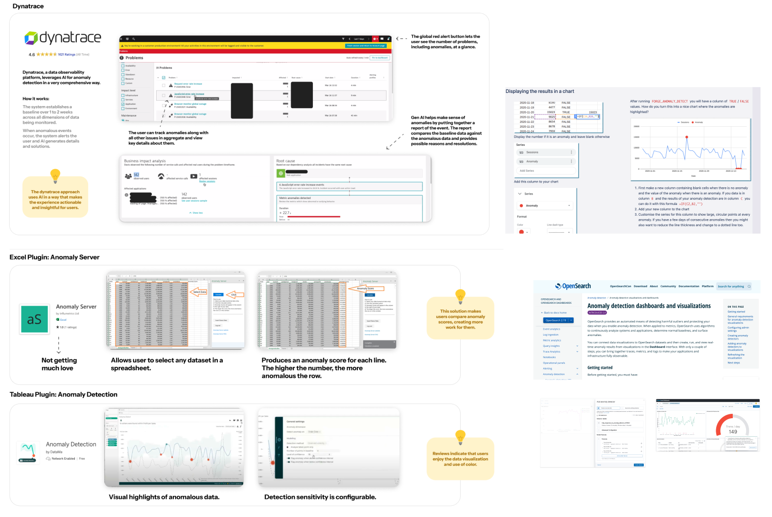
Competitive landscape: How existing tools handle anomaly detection
Research Process
Data Collection: We used a targeted interview protocol designed to surface challenges around error detection, user confidence, workflows, tool integration, and attitudes toward AI support.
Analysis Method: Interview responses were transcribed and reviewed, with key statements, quotes, and moments of tension extracted as sticky-note-style fragments. These fragments were grouped based on shared meanings, patterns, or needs—regardless of question origin—revealing nine distinct themes that informed our design direction.
What Users Actually Need
Users want clear, contextual explanations, not vague alerts or raw stats. Progressive disclosure is key—show a summary first, then allow drill-down for details.
Users need tools that surface only high-priority issues but make it seamless to escalate them to someone who can take action. High-level summaries with contextual drill-downs work best.
A spike in one context might be noise in another. Users prefer customizable sensitivity settings over rigid, one-size-fits-all detection thresholds.
Seamless integration is a must—no need to switch between tools. The solution must embed within users' existing workflows without friction.
User Personas

"A tool that just says 'this is an anomaly' isn't helpful. I want to know what changed, how much, and what might have caused it."

"It's so easy to make a mistake when copying numbers—and I'm the one who gets blamed if something's wrong."

"I like to see a dashboard first thing. Let me see what looks off—I don't need to scroll through everything."
Two Core Flows for Maximum Impact
Based on our research themes—particularly the need to prioritize clarity over complexity, default to progressive summaries with contextual drill-downs, and seamlessly embed within users' existing workflows—we designed two essential user flows.
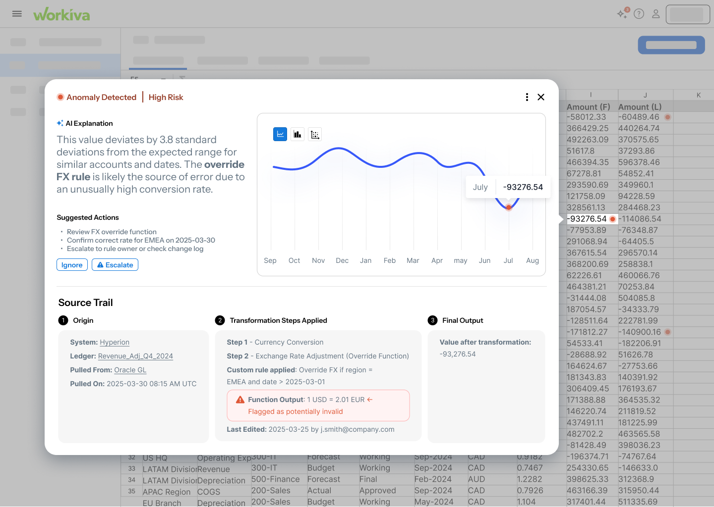
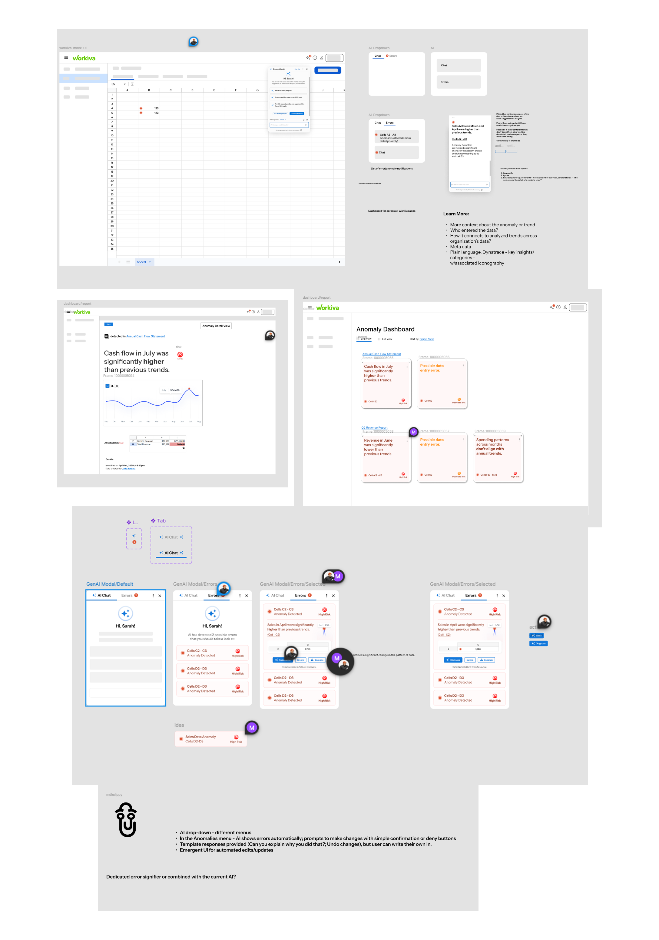
Flow 1: From Spreadsheet to Insightful Escalation
Flow 1: From Spreadsheet to Insightful Escalation
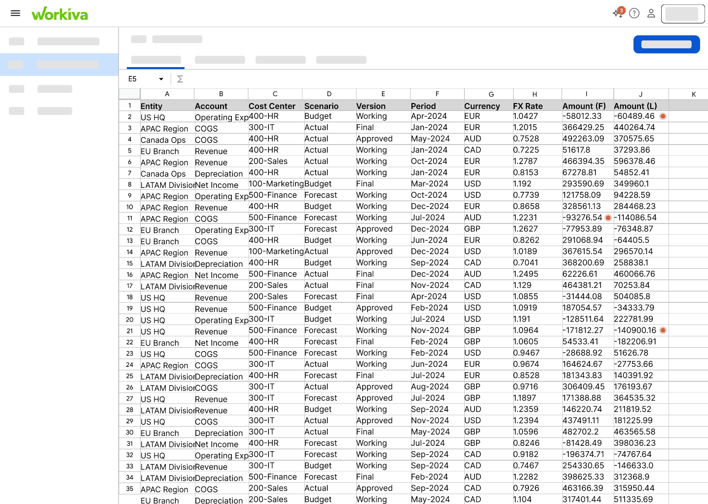
Users start in their familiar spreadsheet view. When an anomaly is detected, AI flags the issue with clear visual indicators. Users can click to expand the error for full context—including AI-generated explanations, suggested actions, and easy escalation options to share with stakeholders.
Key Features:
- Inline issue indicators within spreadsheet view
- Contextual AI explanations comparing baseline vs. anomalous data
- One-click escalation to stakeholders with pre-populated details
- Source trail visualization showing data transformation steps
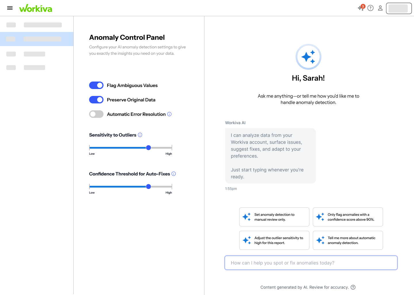
Flow 2: Customizing Anomaly Detection Settings
Flow 2: Customizing the Control Panel
Users access an Anomaly Control Panel where they can adjust detection sensitivity, choose between automatic or manual tweaking, and configure how anomalies are flagged. This addresses the critical user need to "tune the dials" based on context—what's an anomaly in one scenario might be normal in another.
Key Features:
- Adjustable sensitivity sliders for detection thresholds
- Toggle between automatic AI recommendations and manual configuration
- Preview mode to test settings before applying
- Persistent settings that remember user preferences
Design Principles That Guided Us
Three Core Principles
Prioritize clarity over complexity: Default to high-level summaries first, with seamless paths to deeper detail when needed.
Default to progressive summaries with contextual drill-downs: Show users what matters most immediately, then provide clear navigation to supporting information.
Seamlessly embed within users' existing workflows: No context-switching, no new applications to learn—just intelligent augmentation of familiar tools.
Behind the Design: Our Process
From initial sketches to high-fidelity prototypes, our design process was iterative and collaborative. We worked through multiple rounds of ideation, wireframing, and user feedback to refine the interface. Below is a glimpse into our working process—the sketches, explorations, and iterations that shaped the final solution.
Testing with Real Users
We conducted usability testing focused on two key dimensions: effectiveness (does it solve the problem?) and feasibility (can users see themselves actually using it?).
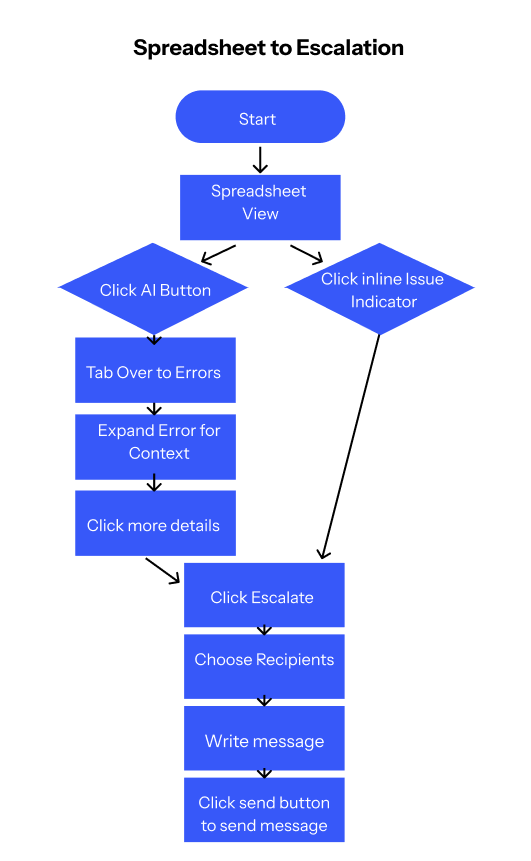
Interactive flow: From anomaly detection to escalation
"It makes it very obvious where you're supposed to look and the way it focuses on the error data is really helpful."
✔ Effectiveness Wins
"I liked that it didn't just say 'error'—it gave me a reason to care, and the option to communicate the problem without having to click through a bunch of screens."
✔ Feasibility Confirmed
"Seems like it fits perfectly on the spreadsheet page. Very nice that you don't have to leave that screen to get things done."
⚠ Room for Improvement
"It was helpful, but sometimes I wasn't sure what kind of issue it was pointing out—maybe this kind of data is just too complex for me."
→ Next Steps
"I'd need to know how this actually plugs into our existing setup—right now it feels a little like a concept, not something I could roll out."
Reflections on Research and Design
As researchers and designers studying Human-Computer Interaction at the graduate level, we approached this project with an awareness of our collective biases—particularly our shared comfort with a wide range of digital tools and our familiarity with user experience conventions.
None of us currently work in finance or operations, and our day-to-day workflows don't involve extensive use of spreadsheets. To address this gap, we developed open-ended interview questions designed to elicit a broad range of responses, aiming to better understand users' past experiences, needs, and frustrations.
Throughout the research and design process, we remained conscious of the risk of overvaluing technical proficiency or projecting our own mental models—both in how we interpreted user input and in how we conceptualized potential solutions. By maintaining a reflexive stance as a team, we worked to ensure that our prototype supports effective anomaly detection in a way that is accessible, context-aware, and inclusive of a wide variety of user perspectives and real-world workflows.
Key Takeaway
AI-powered tools don't need to feel like magic—they need to feel like a helpful colleague who explains things clearly, works where you work, and respects your time. When we prioritize user understanding over algorithmic sophistication, we create solutions that people actually trust and use.